Difficulty
Moderate
Steps
3
Time Required

User-Contributed Guide
This guide is not managed by the site's staff.
Introduction
Learn the way to decide type of chart using.
-
-
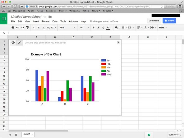
You use it when you are comparing more than 2 variables with same units. And when you want to show data changes over a period of time. Also when you want to show the maximum and minimum value.
-
If you want to make it in Google Sheet, visit <How to Create Bar Chart in Google Sheet>
-
-
-
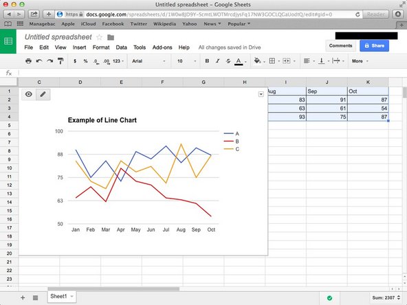
Line Chart is used when you want to show data trends over long period of time. If the number of categories were more than 8. And when you have too many data points to plot and bar chart clutter the data. Also it's useful to show how much does it changed over a period of time.
-
If you want to make it in Google Sheet, visit <How to Create Line Chart in Google Sheet>
-
-
-
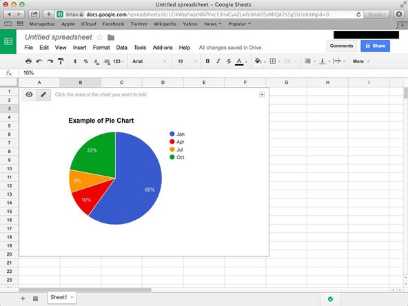
You use pie chart when you want to show breakdown of the data. If you have only 1 series of data. When you have less than 5 points to plot. And when the data points represent the part of whole pie. Also when the constituents are of comparable size.
-
If you want to make it in Google Sheet, visit <How to Create Pie Chart in Google Sheet>
-